 hello@synaryverse.com
Social Media Graphic Design: Format Specs and Best Practices for 2026

You spend two hours on a carousel. The colours are right, the copy is tight, the client signs off. Then it goes live, and the headline on slide one is sitting behind Instagram's caption bar, and the grid preview has sliced your logo in half. Nobody scrolling past will know why it looks off. They'll just keep scrolling.
That's the quiet cost of getting formats wrong. Good social media graphic design isn't only about taste. It's about knowing exactly how each platform will crop, compress, and cover your work before you export a single file.
Specs shift a little every year, so here's where things stand going into late 2026, plus the habits that keep designs looking sharp everywhere they land.
Start with two numbers: 1080 and 4:5
If you remember nothing else, remember this. Most platforms still display feed and full-screen content best at 1080 pixels wide, and vertical ratios like 4:5 and 9:16 now beat square on nearly every network, according to Hootsuite's size guide.
Why vertical? Because people hold their phones upright. A 4:5 post takes up more of the screen than a 1:1 post, which means more attention per scroll. Square isn't dead, but it's no longer the safe default it was five years ago.
Uploading bigger doesn't help much either. Instagram, for instance, scales anything wider than 1080 pixels back down, so a 4000-pixel export just hands the compression algorithm more to chew on. Design at the size the platform actually serves.
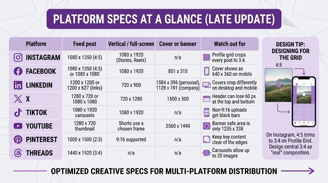
Platform specs at a glance (late 2026)
Bookmark this table. All sizes are in pixels and reflect current recommendations as of 2026.
Platform | Feed post | Vertical / full-screen | Cover or banner | Watch out for |
1080 x 1350 (4:5) | 1080 x 1920 (Stories, Reels) | n/a | Profile grid crops every post to 3:4 | |
1080 x 1350 (4:5) or 1080 x 1080 | 1080 x 1920 | 851 x 315 | Cover shows as 640 x 360 on mobile | |
1200 x 1200 or 1200 x 627 (links) | 720 x 900 | 1584 x 396 (personal), 1128 x 191 (company) | Covers crop differently on desktop and mobile | |
X | 1280 x 720 or 1080 x 1080 | 720 x 1280 | 1500 x 500 | Header can lose 60 px at the top and bottom |
TikTok | 1080 x 1920 carousels | 1080 x 1920 | n/a | Non-9:16 uploads get black bars |
YouTube | 1280 x 720 thumbnail | Shorts use a chosen frame | 2560 x 1440 | Banner safe area is only 1235 x 338 |
1000 x 1500 (2:3) | 9:16 supported | n/a | Keep key content clear of the edges | |
Threads | 1440 x 1920 (3:4) | n/a | n/a | Carousels allow up to 20 images |
One thing the table can't show: the grid. On Instagram, a 4:5 post looks fine in the feed but gets trimmed to 3:4 on your profile. If your brand relies on a tidy grid, design the centre 3:4 area as the "real" composition and treat the rest as bleed.
 Best practices that actually move the needle
Respect the safe zones
Vertical formats are crowded. Usernames, captions, like buttons, and progress bars all sit on top of your design. Meta's own ad specs suggest keeping roughly the top 14%, bottom 35%, and 6% on each side of a Reel free of text and logos. Build that as a locked guide layer in your templates so nobody forgets.
Design for a thumb, not a monitor
Most people will see your graphic at about the width of a credit card. Headlines need to be readable at that size, which usually means fewer words and heavier weights. If you have to zoom in on your phone to read it, it's too small.
Pick the right file type
JPG works for photos. PNG is better for anything with crisp text, flat colour, or a logo, because it holds edges cleanly. Facebook recommends PNG for profile and cover images with text for exactly that reason.
Build one master, then adapt
Don't redesign from scratch for every platform. Create a core layout at 4:5, then resize to 9:16 and 1.91:1 by rearranging elements rather than stretching them. A consistent brand identity makes this far easier, since colours, type and spacing are already decided.
Preview before you post
Scheduling tools and the platforms' own drafts let you see the crop. Check it on an actual phone, in both feed and profile view. Two minutes here saves an awkward delete later.
Keep carousels coherent
Every slide should share a grid, margin, and type scale. Slide one does the heavy lifting, so put the hook there and save detail for later frames.
When to bring in a design partner
If you're posting a few times a week on one platform, a solid template kit and this guide will carry you a long way. Things get harder at scale. Five platforms, three formats each, weekly campaigns, and paid ads with their own specs add up to dozens of exports a week, and every one is a chance for something to get clipped.
That's usually the point where teams look at social media graphic design services. A good partner builds the template system once, keeps it current as platforms change, and frees your marketers to focus on the message. At Synaryverse, we pair static design with motion and AI video so Reels, Stories, and feed posts all feel like one brand rather than three.
Whatever route you take, judge the work on a phone, in context, against the specs above. That's where it lives.
FAQs
What is the best image size for social media in 2026?
+
There's no single size, but 1080 x 1350 (4:5) is the most versatile feed format across Instagram and Facebook. For Stories, Reels, and TikTok, use 1080 x 1920 (9:16). LinkedIn and X lean wider, so 1200 x 1200 or 1280 x 720 work better there.
Can I use the same graphic on every platform?
+
You can, but it rarely looks its best. Ratios, crops, and overlays differ enough that a single file will get trimmed or letterboxed somewhere. Start from one master design and adapt the layout for each format.
Why do my images look blurry after uploading?
+
Usually it's compression. Export at the platform's recommended width (often 1080 px), use PNG for text-heavy graphics, and avoid uploading files far larger than needed, since the platform will resize and recompress them.
How often do social media specs change?
+
Small changes happen most years, like Instagram's shift to a 3:4 profile grid. It's worth checking a current guide each quarter and updating your templates when something moves.
What do social media graphic design services typically include?
+
Most cover post and carousel design, Story and Reel graphics, ad creatives, profile and cover art, and reusable templates. Many also handle resizing for each platform and motion graphics. Ask for a sample set across formats before you commit.

